Enhanced features for better rabies surveillance
While collecting rabies-related data directly from the community is vital if users want to have accurate data at their disposal, if the data cannot be collated, analyzed and visualized in real time and in an easily interpretable way, it would be useless. For that reason, the Rabies Epidemiological Bulletin (REB) – the data hub where users of GARC’s free surveillance tools can access their visualized data in real-time – is a critical tool for any rabies stakeholder looking for a data-driven and sustainable programmatic approach.
But just like any other piece of software like those on mobile phones or computers, the REB software also needs to be updated to improve the system, the tools, and the user experience. That is why we decided that the time was right for a major upgrade to the system, which we recently undertook without any existing user of the system even knowing about it. In fact, users will tell you that they logged on one day and noticed that the REB looked different and had some great new features – making the overall user experience all the more enjoyable and beneficial!
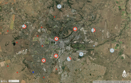
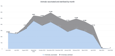
Among the most notable improvements are the advanced visualizations of maps and graphs, which enable users to explore their data more effectively. With the improvements to the maps that now display data in a more user-friendly way, users can interact with the data more dynamically allowing them to gain insights with greater ease and precision. On the other hand, graphs can now be displayed using different colors and shading, helping users and decision-makers differentiate between different data more easily at a glance. This is also a great feature for reports to donors, for example, as users can more closely match the outputs to their own styles and needs. These are the kind of visual changes that play a pivotal role in terms of ensuring that users gain the insights that they need from their data more readily and more easily. But you might be asking yourself why these cosmetic changes should be considered noteworthy. That is because improved data visualization means that users need to spend less of their precious time analyzing data – freeing them up to spend their time in the communities that they serve.
Beyond the visual enhancements, the updated software also brings improvements in usability, security, and system stability. Most notably, the user interface has been refined to be more intuitive, allowing new and seasoned users to easily navigate and leverage the full capabilities of the REB. Furthermore, the enhanced security measures ensure that sensitive data remains better protected, while stability improvements ensure that users can continue to rely on a robust and consistent system for their critical work.
These upgrades not only underscore GARC’s commitment to maintaining uninterrupted service for all stakeholders involved in rabies control and prevention, but also offer a significant step forward in the fight against rabies by providing users with the tools they need to effectively track and combat this deadly disease.
Be sure to contact us if you are not yet a user of the GARC Surveillance tools so that we can arrange a demonstration of the system and the different free data collection tools that we have on offer.
Article contributed by: Andre Coetzer, Technical Director, GARC.